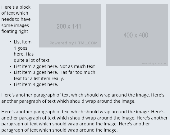
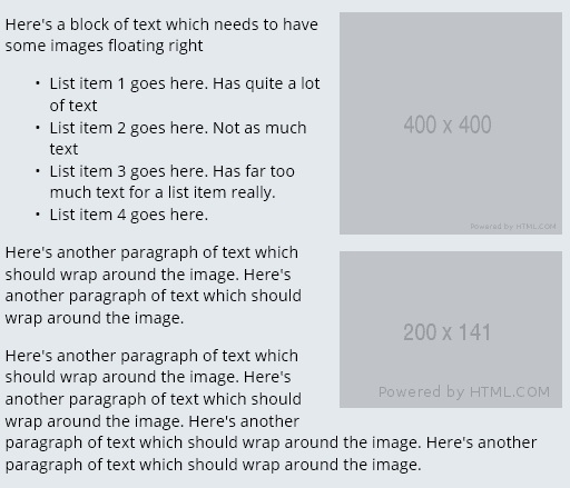
We needed to display 2 images, one under the other, floated to the right of a paragraph of text and a list.
If you just use float:right on each image, the images appear side-by side.
To resolve this using only inline CSS, add float:right to both images and clear:both to the second image:
<a href="#">
<img src="https://via.placeholder.com/400x400" alt="Image 1" width="200" height="200" style="max-width: 200px; max-height: 200px; padding-bottom: 15px; padding-left: 15px; float: right;"/>
<img src="https://via.placeholder.com/200x141" alt="Image 2" width="200" height="141" style="max-width: 200px; max-height: 200px;padding-bottom: 15px; padding-left: 15px; float: right;clear:both;"/>
</a>
<p>Here's a block of text which needs to have some images floating right</p>
<ul>
<li>List item 1 goes here. Has quite a lot of text</li>
<li>List item 2 goes here. Not as much text</li>
<li>List item 3 goes here. Has far too much text for a list item really.</li>
<li>List item 4 goes here.</li>
</ul>
<p>
Here's another paragraph of text which should wrap around the image. Here's another paragraph of text which should wrap around the image.
</p>
<p>
Here's another paragraph of text which should wrap around the image. Here's another paragraph of text which should wrap around the image. Here's another paragraph of text which should wrap around the image. Here's another paragraph of text which should wrap around the image.</p>
You can see a working example here https://jsfiddle.net/techexplorer/q71k5wgd/